
Audited and enhanced the user experience of an internal platform for its users and builders.
Overview
Problem
Our client's SharePoint platform was difficult to use, which led to agents having trouble navigating and finding needed information. This resulted in longer task completion times and delays in their work.
Process
The framework I developed for assessing their platform was divided into three categories: Navigation, Structure, and Presentation. It clarified what would be examined and helped the client better understand the difference between good and bad UX.
Delivery
All UX improvement suggestions were tested in SharePoint, with guides showing easy implementation. The delivered playbook enabled the client to enhance the platform's UX, preparing their team for the future.
Context
My #1 goal as a UX Designer is to build the path of least resistance for users to accomplish their goals. At KPMG, our public sector client had a SharePoint platform that was built and maintained by their team for their agents to access and refer to, and it was not easy to use.
They constantly received feedback that it was difficult to navigate and find the information they needed, making the time they take to complete their tasks swell up and delay the rest of their to-do list. Not only was it difficult to use, it was also failing at multiple levels of accessibility, adding on to the frustrations their agents felt.
Understanding change was needed, they came to my manager, who assembled a team of myself and a content specialist to do the following:
1
Demonstrate how we plan to assess their platform.
2
Inform them of what creates frustrations for their users.
3
Provide recommendations to eliminate and prevent these and future frustrations .
Timeframe
We had to get a move on and we had to move fast. Our budget for this project allowed only 3 weeks of work. Together with the client, we established the work that would be done over the three weeks, and the deliverables each week would provide.
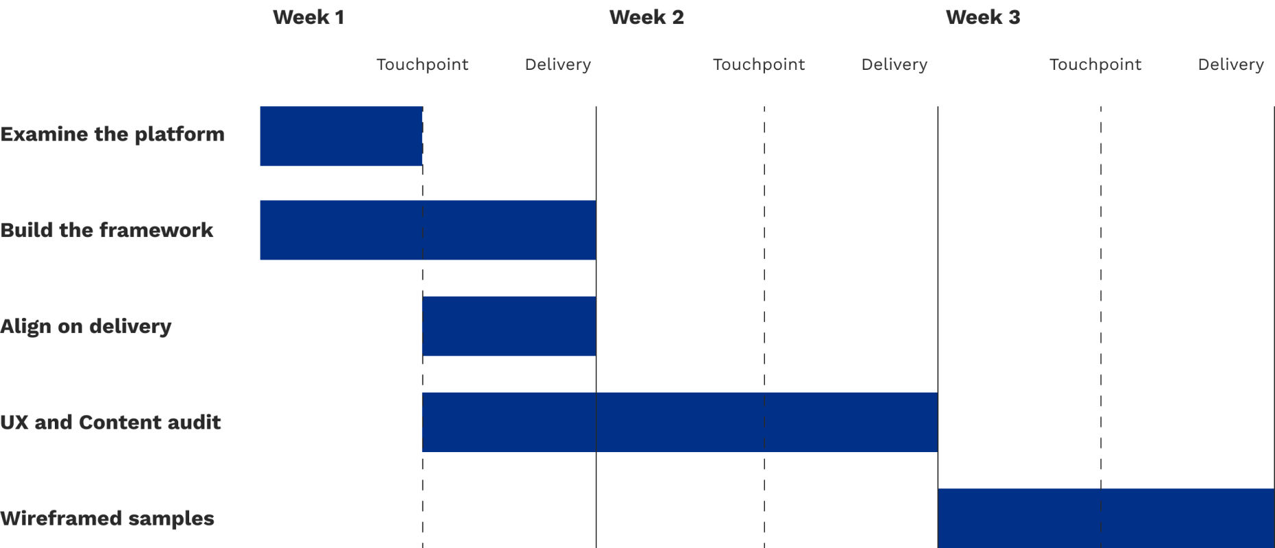
Scope
As I went into the platform to take a look at what I’d be working with, I was immediately faced with hundreds and hundreds of pages. With such little time on the project, I worked with the client to narrow down the scope of where the majority of their comments and flags come from to their top 3 highest volume areas.
Now that our scope was set, it was time to get to work. For this project to succeed, establishing a shared understanding of usability and accessibility fundamentals would make communicating the assessment smoother, and would explain the logic and motivations behind the direction. To build out this framework, I consulted the following publications and government regulations:
Framework
Examining these works allowed me to identify common overlapping areas of usability and with the help of the content specialist, how to communicate them plainly. The framework was organized into three distinct categories: Navigation, Structure, and Presentation.
Navigation
How the user gets around your website. Your users need to be able to find what they need without being overwhelmed by what’s on the screen.

Presentation
How your website is seen by your users. It needs to be consistent, accessible, and visually appealing.

Structure
How your information is presented to your users. It needs to be easy for them to understand.

This framework helped the client understand what was going to be examined and assessed on their platform and allowed them to further and deepen their understanding of what separates good ux from bad ux. a key goal for this audit was to present the findings in plain language to be accessible for all audiences, and this was enacted from the beginning with the framework. The full framework graphic had descriptors of each heuristic, however, to preserve web readability at smaller screen sizes, they have been removed.

Audit
To demonstrate how the audit would be presented, as well as ensure the client agrees upon the method we plan to deliver, I crafted a sample deliverable, grabbing screenshots of the platform and dissecting where the UX risks appeared and annotated the issue as well as what could be done to improve it/prevent future risks. With the client approving of the delivery method, the audit was underway.
After sorting the slides by levels of risk from urgent to low priority, as well as highlighting where good UX was applied, the audit identified 3 critical areas that needed improvement. Due to the confidential nature of the work, I am unable to share the screens that we audited. In lieu of them, I created iconographic low-fidelity wireframes to display the way content and information was presented.


Regardless of the category of page, the platform presented information through different layouts, which presents opportunities for confusion


In this specific instance, the platform had zero consistency in how buttons were displayed, acted, and referred to on each page

This would often force them to start their journey all the way at the beginning, increasing the time between their tasks
Solutions
While relaying these usability and accessibility risks, we also presented opportunities on on how to improve them. To simplify the process of building out pages for the platform, I created three distinct categories of pages that would have their own visual language. Establishing these categories allowed to combat the overwhelming cognitive load the users as well as allow for future contributors to seamlessly expand on the platform and ensure consistency.
Category 1

Category 1 was designed for pages introducing new topics.
The biggest introduction to the page was the addition of the Breadcrumb component below the header. This addition would provide users with the knowledge of where they are in the platform and simple navigation to where they originated. Additionally, the simplification of the Button styles is meant to represent that only filled buttons are used to link pages that take the user out of the platform.
Category 2

Category 2 was designed for pages that were intended to go in a specific order.
Continuing with the addition from Category 1, the Breadcrumb trail assists users in identifying their spot in their journey. The Button styles presented here are intended to demonstrate to the user their ability to progress forwards and backwards in their journey, and are meant to only be used for such purposes.
Category 3

Category 3 is combining the previous two styles into one. It is meant to be used when the content on a page like Category 2 would require the user to leave the platform.
Delivery
Everything to improve the UX that was suggested to the client was tried and tested in SharePoint. To smooth over their upcoming redevelopment, I crafted guides to demonstrate how to implement the above changes, ensuring that the solutions could be implemented with ease. The playbook delivered to the client put them in the position to drastically improve the UX of the platform, leaving them set for the future of the team.