Enhancing internal tools to become more accessible to staff and its users.

KPMG Canada
UX Design
I improved the accessibility of information in a public-sector client’s internal tools by designing templated wireframes that simplified how content was organized and navigated by staff. The templates were divided into three distinct categories: New topics, Sequential items, and Sequential items with new topics.
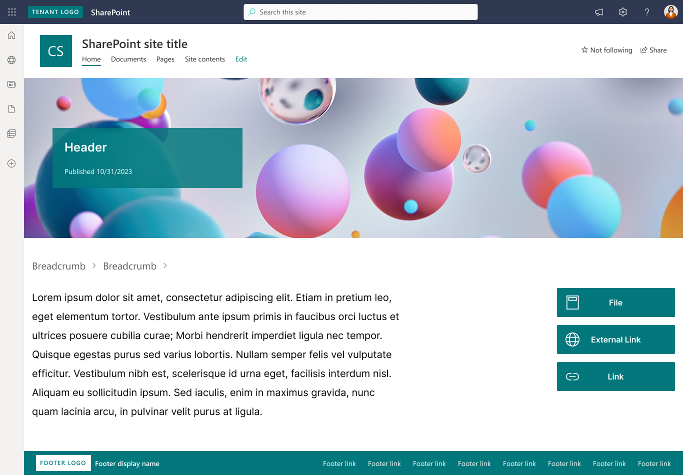
New topics are pages that are at the beginning of a flow. They house Related Links that would either be files, external links, or internal links, all differentiated through their icon.
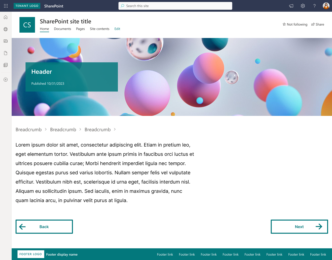
Sequential items are pages that put the user on rails to follow a specific path. The only interactives here are the "Back" and "Next" buttons which use a different styling from the Related Links buttons.
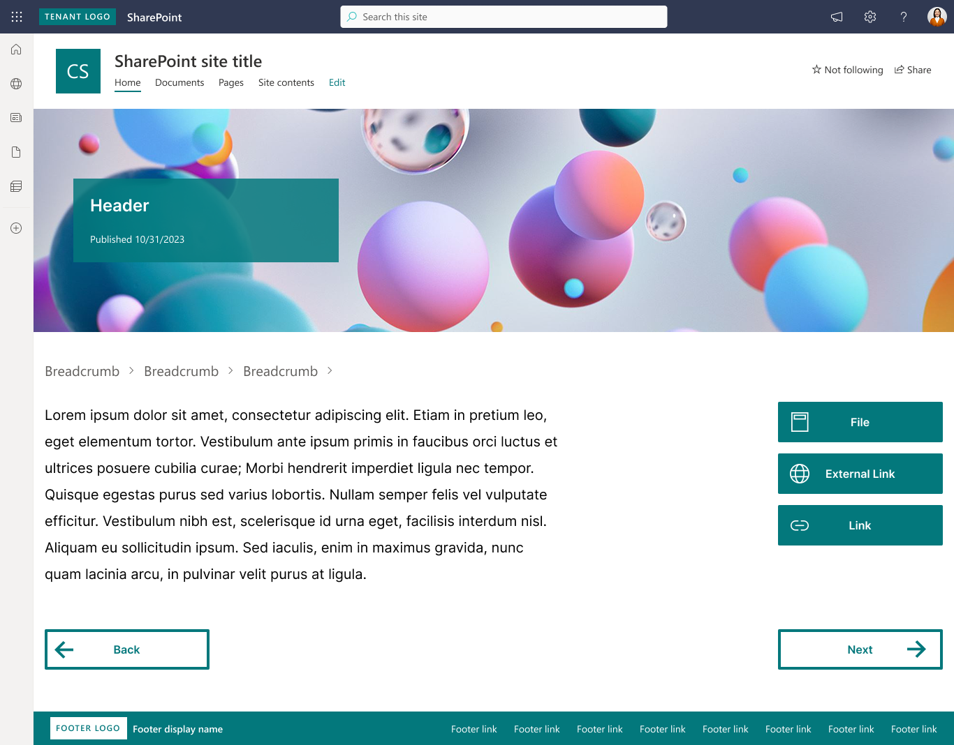
Sequential items with new topics are pages that follow a specific order, but also contain Related Links. The differentiation of button styles establishes mental models with the user highlighting what the goal of each interactive element is.
Overview
A public sector client engaged my team for us to examine why their internal Microsoft Sharepoint site was difficult for their staff to use. They presented to us the results of internal research conducted around the efficacy of their platform and discovered that the common frustration was a lack of organization from page to page, and it was difficult to find the information they needed.
To approach this, I drafted a framework built to examine both web usability and content to pinpoint areas of improvement for the client. This all culminated in templated designs for the client to take back and apply to information dense pages of the site.
These designs aimed to improve the workflows of three key stakeholders: users, developers, and content writers.
Success metrics
Findability
Can users find the information they need quicker?
Internal testing and client validation showcased the new solution made information more scannable and easy to find.
Feasibility
Can the client continue to implement these changes without our intervention?
Working with our in-house sharepoint developer, we were able to devise a solution that was light weight and easy for our clients to implement
Problem
Unfortunately, our timeframe to work on this was brief. We had to get a move on and we had to move fast. Our budget for this project allowed only 3 weeks of work. Together with the client, we established the work that would be done over the three weeks, and the deliverables each week would provide.
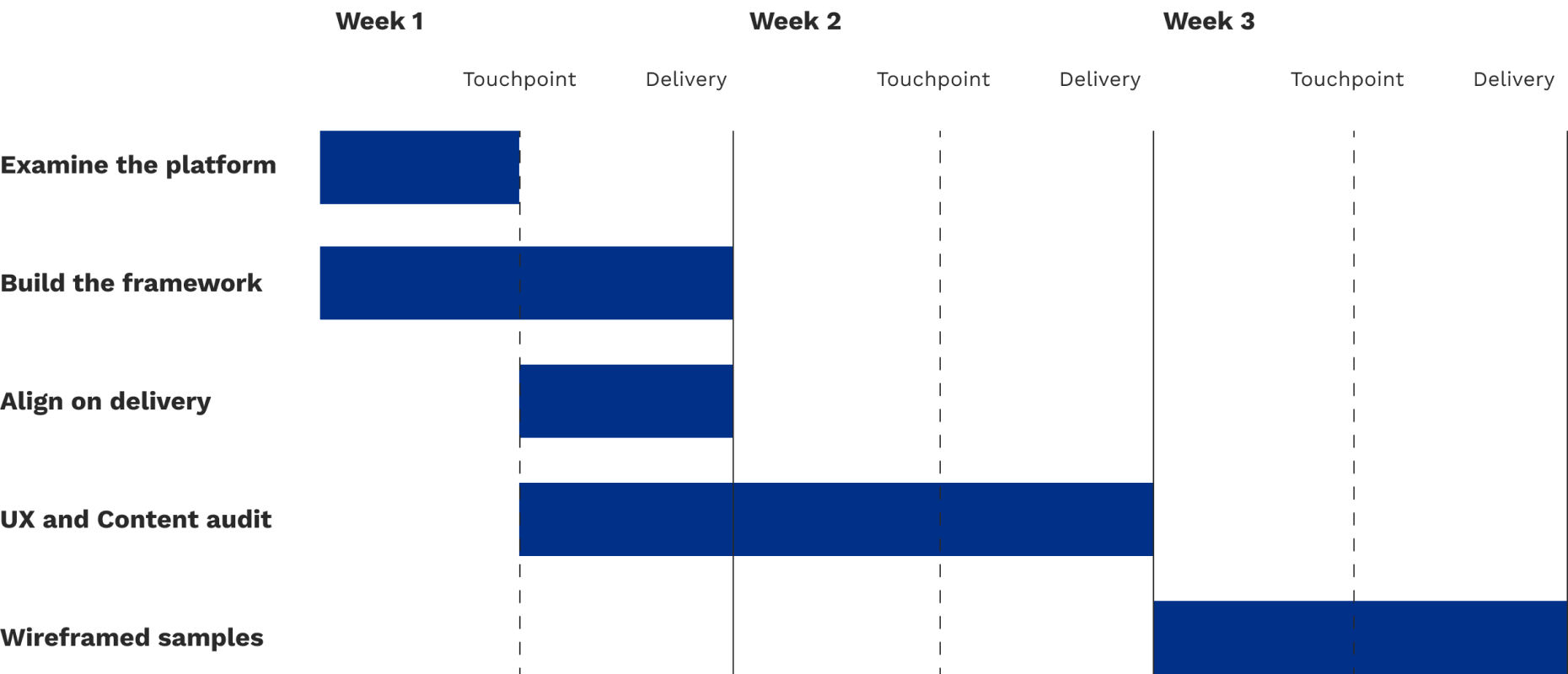
Three week timeline
3 key decisions
As I went into the platform to take a look at what I’d be working with, I was immediately faced with hundreds and hundreds of pages. To ensure that this project could be delivered on time and successfully, we came to the client with 3 key understandings of how we wanted to proceed.
Establish a shared understand of usability and content fundamentals through a framework to ensure both us and the clients came to this project at the same level, allowing them to meet the team at our level of expertise.
Focus on high traffic areas of the site and pages that are information dense to simplify the work needed to be done in such a short period of time.
Deliver the work in an itemized deck, highlighting where the usability and accessibility risks were and what could be done to mitigate them.
Process
To establish a shared understanding of usability and accessibility fundamentals, I built out a framework by consulted the following publications and government regulations:
Examining these works allowed me to identify common overlapping areas of usability and with the help of the content specialist, how to communicate them plainly. This resulted in our UX Fundamental Improvement Framework that was organized into three distinct categories: Navigation, Structure, and Presentation. This framework helped the client understand what was going to be examined and assessed on their platform and allowed them to further and deepen their understanding of what separates good UX from bad UX. To preserve readability of text, the descriptions attached to each item have been removed.

Visual representation of the framework
Using this framework as our guide, I set out to identify and communicate aspects of the client platform that infringed on this framework. The bulk of the audit was delivered through an itemized deck, as such:
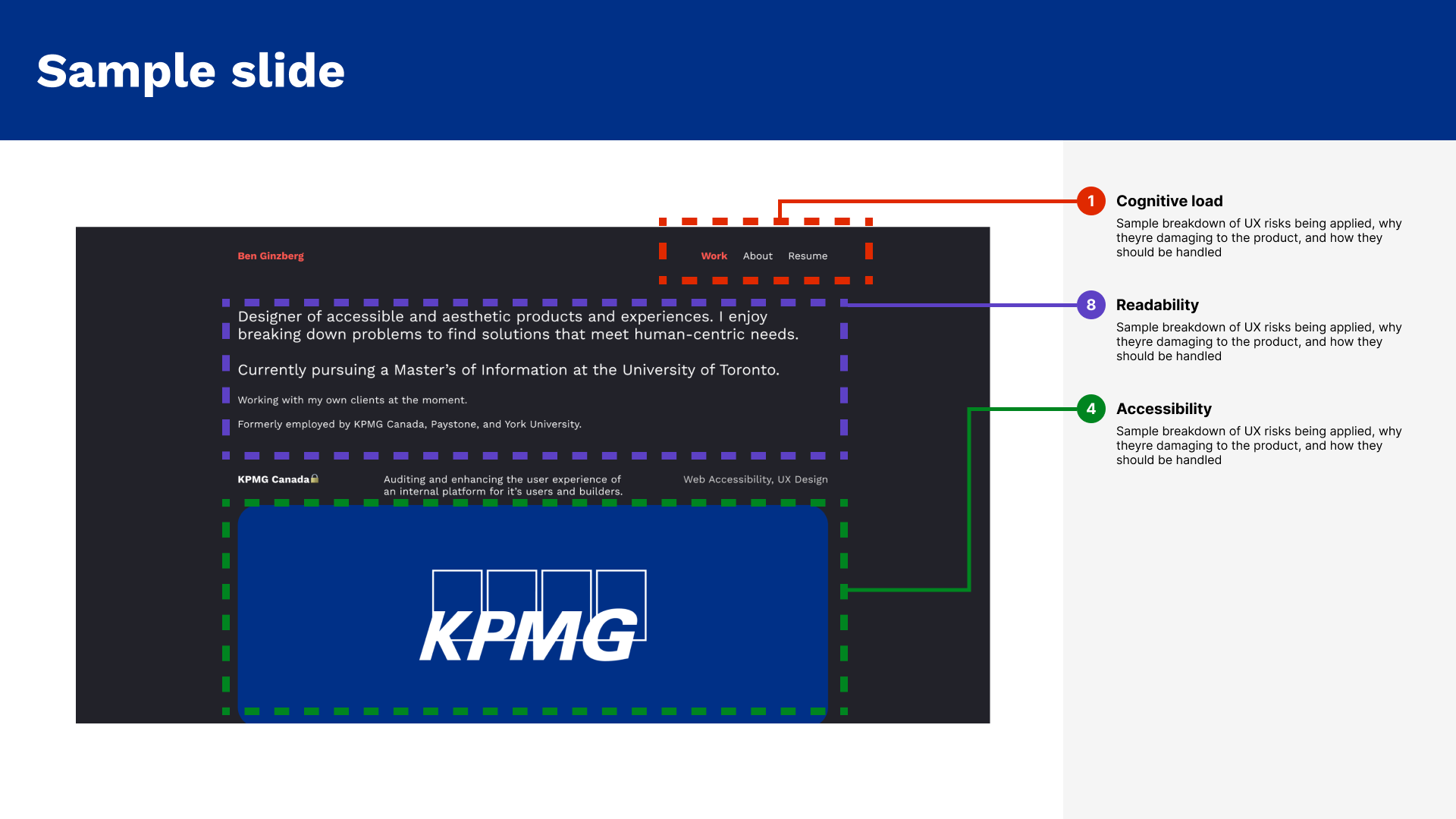
Mockup of the slide deck design with dummied content
Through these efforts, I boiled down the crux of the problem into the same buckets the framework was organized into.
Cognitive load
Users were faced with overwhelming cognitive load from being forced to understand new page layouts on each page.
Regardless of the category of page, the platform presented information through different layouts, which presents opportunities for confusion
Consistency
Lack of consistency in elements and their placement prevents the user to understand their expected use.
In this specific instance, the platform had zero consistency in how buttons were displayed, acted, and referred to on each page
User Control
The platform was missing key interactive elements indicating the user’s place, preventing them from navigating forwards or backwards with ease.
This would often force them to start their journey all the way at the beginning, increasing the time between their tasks
Leanings
Establishing a shared understanding of our analysis helped the client meet us where we are and smoothed over the communication around improvements they could make. Our recommendations, while tailored to their platform, are good rules of thumb to follow for usability as a whole. Simplifying content flow and navigation helps reduce cognitive load and user friction. Standardized patterns improve both accessibility compliance and maintainability. And lastly, deploying these through targeted refinements can deliver meaningful improvements quickly.
When a digital platform keeps all this in mind, both the people working on it and the people using it benefit.


